Stratford School of Interaction Design & Business
OBSERVE | LISTEN | RESEARCH | LEARN | ADAPT | CHANGE | COLLABORATE


This project was for a BBC website and marketing design challenge that I did for one of my exchange classes. The objective was to create the layouts for mobile, tablet and computer, as well as create an ad poster. Based on all the research that I did regarding the UK, number of views and their preferences, I decided to emphasize the cultural side of BBC4. This is why I have made the ad like a bouquet of flowers due to the diversity of the program. Slide over the images to see my work process and final results.
THE POWER OF TEAM WORK
Together in a team, we designed a solution to the Fast Fashion issue facing the world. My main responsibility within the group was mainly research into the problem and collecting SME information. The solution we created involved partnering with brand companies to take their excess clothing, send it to a recycler to turn to thread, which could be sent back to the original company to prevent waste.
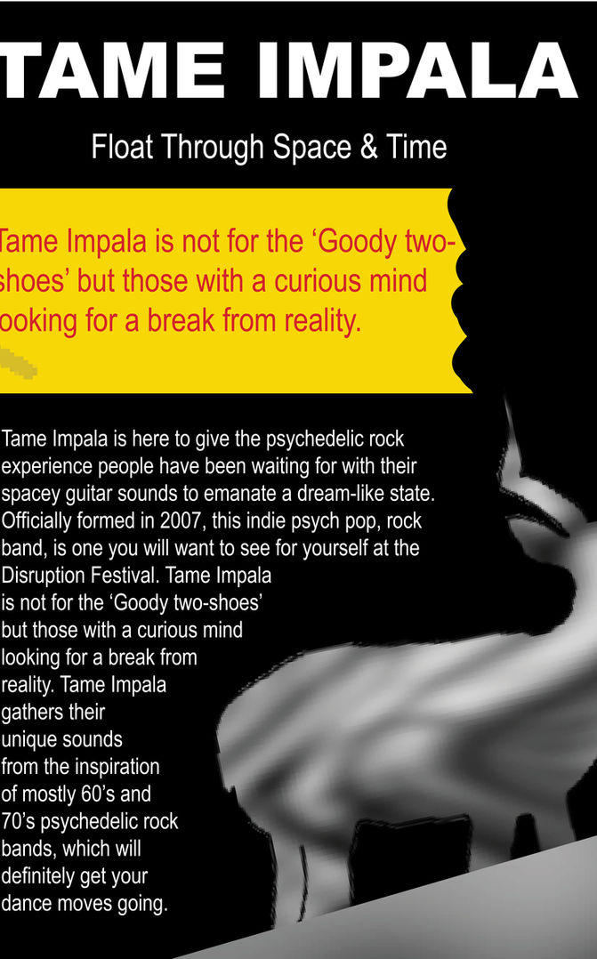
My solution to making the Disruption Festival a more immersive experience for people is to make it more specific towards a particular group of people for starters. It is more difficult to cater to everyone and people are more likely to know what they are in for, if it is a specific niche. I decided to create a magazine cover and spread based on Electronic Indie Rock Bands because it is not mainstream and it is unique. Seeing as it is the decline of club culture that is one of the core concerns, having bands that are not mainstream is important. In todays culture there is also a growing follower-ship of Indie music as well as Interest from people looking to expand their music taste. As a result I choose to feature the bands Tame Impala, Radiohead, Beach House, Passion Pit and Daft Punk. Despite the fact that they all classify as Electronic Indie rock bands they are also all very different with is nice for people paying to go to a festival.
The cover of my magazine is a face that you cannot see the eyes or any detailed features of. This is because in terms of disruption I am calling people out to break free physically and mentally in order to experience something new and exciting. The person on the cover can not be identified as either a male, female, or other to eliminate any discriminatory or bias perspectives. They are also breaking free from all the censorship around them, or more so restrictions. It isn’t just about breaking free, but realizing that censorship shouldn't stop people from expressing what they want to express. I choose very bright colours with a large contrast against the black background to provide a more psychedelic affect. This is because these bands have a psychedelic ambiance to them that puts a lot of listeners into a bit of a dreamy state of mind. I also choose very saturated colours because it is more bold. Clearly if people are not going to clubs/ festivals as much anymore, they are sick of something, whether it’s the people, the music, the high cost, etc. My design cover and spread is very bold yet chaotic because I want to convey the notion that a lot of people in their 18-20’s are a little lost or more so figuring out themselves. I tried to make my design so that it would relate to people in the sense that everything in life is in disruption and constantly changing at this stage of life. My design doesn’t tell anyone who they should be or who they want to be because it is about the perception of the mind urging people to let go and free their minds. To do this though this causes a lot of disruption. On the front cover I also tried to create a 3D effect on the mouth of the person to enhance the Psychedelic feeling.
On the magazine spread sheet I have a more smokey touch as I wanted to give the effect of objects disappearing. Nothing last forever so why should people be so afraid to disrupt the status quo. In terms of the App, I decided to go with a more simple icon to make it more clean to look at on one’s phone because, although my magazine cover and spread are a little more dense, it would be more difficult for the user if I put more on the App. My icons for ‘My Profile’, ‘Find My Tent’, ‘Help’ and the ‘Disruptive Guide’ are all disfigured slightly to maintain the disruptive effect but they are clear and bright.


THE JOHANN
This is an animation from my first year, where my assignment was to create an animation based of an individual's brand. I made this piece for a peer in my class, Johann. Johann loves computer games and has a personal aim to show people a new perspective in design and how this can develop ideas.
As a result, I started this animation with building blocks that turn into a house, then a face and finally a game. This animation reflects the development of design thinking and illustrates how one idea or object is not restricted to one purpose or use. This is also a representation of how taking a new perspective allows people to build off of, and improve design. We do this by looking with a new perspective and asking ourselves, what else could this be?


